Introduction
Excel is one of the most popular tools that people use for data analysis and management. With its user-friendly interface and built-in graphing features, Excel is the perfect tool for creating insightful and impactful visualizations that help communicate complex information simply and effectively.
In this article, we will provide a comprehensive guide for beginners on how to create graphs in Excel. We will start with the basics and then delve deeper into more advanced graphing techniques and customizations. By the end of this article, you will have the knowledge and skills needed to create powerful, impactful graphs using Excel.
Step-by-Step Guide to Creating a Graph in Excel: A Beginner’s Tutorial
The first step in creating a graph in Excel is to open the Excel worksheet that contains your data. Once you’ve done that, click on the “Insert” tab in the Excel Ribbon and choose the chart type you want to create. You will see several chart types available, such as column, line, pie, bar, etc. For this tutorial, we will create a simple column graph.
After choosing the chart type, select the data range you want to graph by clicking and dragging the mouse over the cell range that contains your data. Excel will automatically insert a graph into your worksheet, which you can then customize to your specifications.
Next, we will customize our graph by adding and changing elements. For example, we can add a chart title, change the axis label, and even add a legend to help explain the data. To do this, click on the chart to select it and then click on the elements you want to change. Excel will display various formatting options that you can use to modify the selected element.
Finally, Excel offers a wide range of customization options for your graph, such as changing the chart type, formatting the background, and adjusting the color scheme. These options can be accessed by clicking on the “Chart Elements”, “Chart Styles”, and “Chart Filters” buttons in the Excel Ribbon.
10 Graph Types You Can Create in Excel and How to Make Them
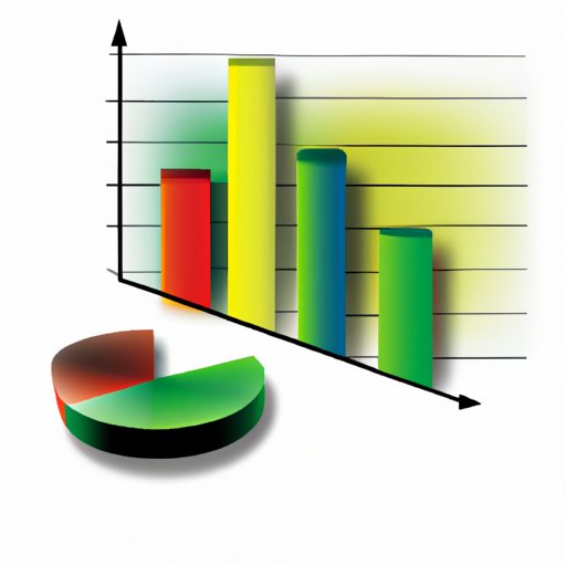
Excel offers a wide variety of graph types that you can create, and each type has its unique benefits. Knowing which graph type to use for a given set of data can help you communicate your data more effectively. Here are ten different types of graphs that you can create in Excel:
- Column Graphs
- Line Graphs
- Pie Charts
- Bar Graphs
- Area Graphs
- Scatter Plots
- Combo Charts
- Stock Charts
- Radar Charts
- Bubble Charts
Each of these graph types has its unique features, and some are better suited for certain types of data than others. For example, line graphs are better suited for showing trends over time, while pie charts are good for showing percentages and proportional data.
Creating each of these graph types in Excel is relatively straightforward. Follow the same steps you used to create the simple graph in the previous section, but this time, make sure to choose the appropriate chart type from the “Insert” tab in the Excel Ribbon.
Excel Graphs: How to Customize Them for Impactful Data Visualization
Customizing your graph in Excel can help you communicate your data more effectively and make it easier for people to understand. Here are some customization tips you can use to make your graph more impactful:
- Choose appropriate colors that make the data easier to read
- Use bold, clear fonts that stand out against the background
- Adjust the size of the graph to fit the available space
- Use appropriate labels and annotations to supplement the data
- Make sure the data is easy to read and understand at a glance
Excel offers a wide range of customization options that you can use to achieve these goals. For example, you can change the background color of your chart, add data labels, or adjust the spacing between the bars on a column chart. Experiment with these settings to see what works best for your data.
Excel Graphs: How to Add and Format Data Labels
Data labels are an essential part of any graph because they help explain the data to the audience. In Excel, you can add and format data labels easily. Here are some steps you can follow to add data labels to your graph in Excel:
- Select the data range that you want to add labels to
- Choose the “Insert” tab in the Excel Ribbon
- Select the type of graph you want to create
- Select the graph that you want to add labels to
- Right-click on the data series that you want to label and select “Add Data Labels”
- Format the labels by selecting them and adjusting the settings in the Excel Ribbon
When adding and formatting data labels, there are several best practices to follow. For example, avoid cluttering the graph by only showing labels that are necessary. Use percentages instead of raw numbers to make the data easier to understand, and avoid overlapping labels. These best practices will help make your graphs more impactful and effective.
Common Graphing Mistakes in Excel and How to Avoid Them
Creating effective graphs in Excel requires not only knowledge of the tools and techniques but also an understanding of the common pitfalls to avoid. Here are some common graphing mistakes that people make in Excel and how to avoid them:
- Using the wrong type of graph for the data
- Cluttering the graph with unnecessary labels and elements
- Not labeling the axes properly
- Using inappropriate colors that make the data hard to read
To avoid making these mistakes, you can follow some simple guidelines. For example, choose the appropriate graph type for your data, use clear and concise labels, and avoid overwhelming the graph with too much information. These guidelines will help you create more effective and impactful graphs in Excel.
Conclusion
Creating graphs in Excel is a critical skill for anyone working with data. Excel’s user-friendly interface and robust graphing tools make it easy to communicate complex data simply and effectively. By following the steps and tips outlined in this article, you can create impactful and insightful graphs that help you tell your data story effectively. Remember to experiment, try new things, and always strive for clear and straightforward communication of your data.
If you want to learn more about graphing in Excel, there are plenty of resources available online that can help you improve your skills. Excel is a powerful tool, and with a little practice, you can become an expert at creating impactful data visualizations.